×

Error

Email Protector cannot function. Regular Labs Library plugin is not installed.
  • Packaging Files in InDesign

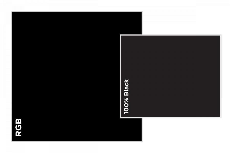
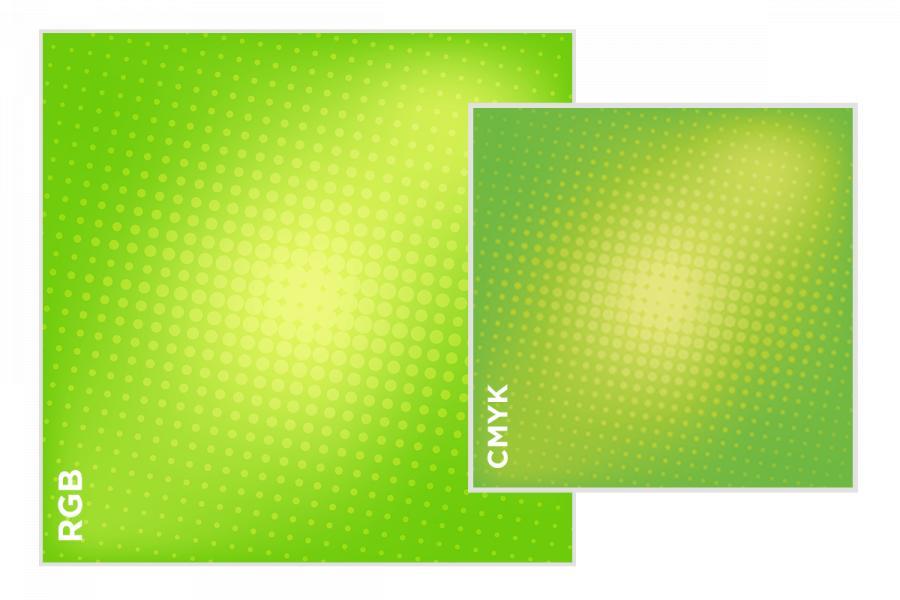
    For complex projects, we prefer to receive native application files (not PDF’s) to provide you with the best printing experience possible. However, if submitting a PDF for a job, please ensure it is converted to 4 color CMYK (with the exception of dielines and actual spot ink colors).

    • Remove any unused layers before packaging
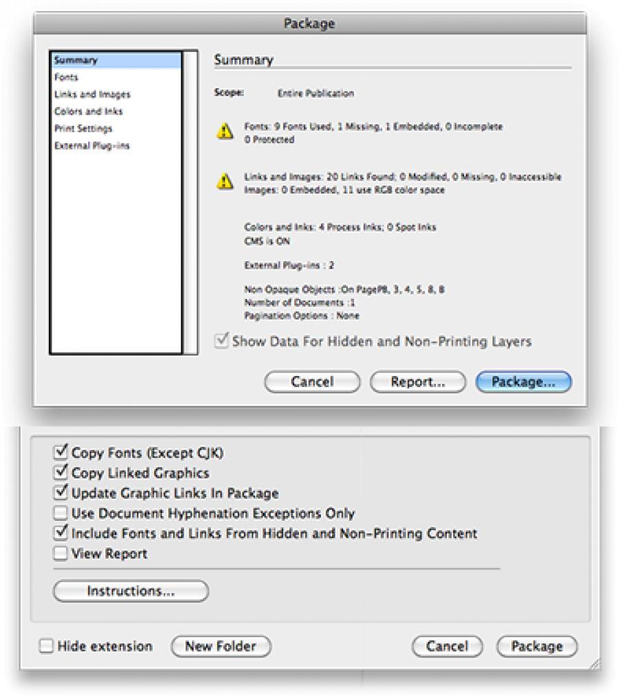
    • Go to File > Package.
    • Summary: On this screen you will see any spot colors used, RGB images, image sizes and fonts in the file.
    • Fonts: Check the font(s) you used in the document in case you need to remove anything saved on the pasteboard.
    • Links and Images: In the Links and Images section, you can see the file type and the resolution.
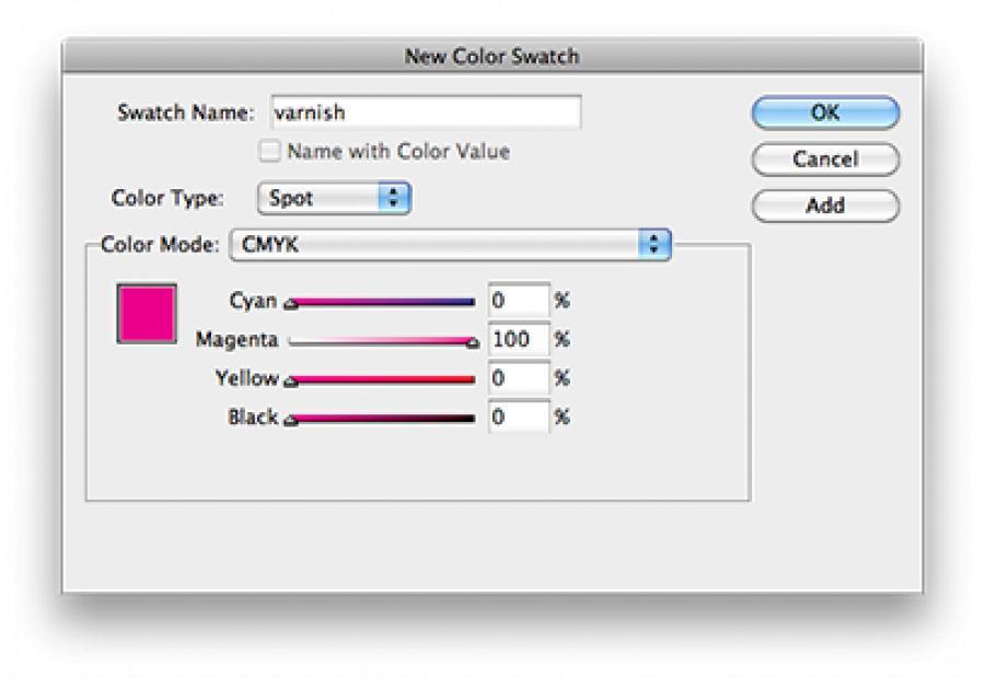
    • Make sure to choose the option to “Include Fonts and Links From Hidden and Non-Printing Content” just in case there is anything on another hidden layer (such as a varnish layer) you need to preserve.
    • Please ZIP up the contents of the newly created folder before sending to us. If using a Mac please ZIP on the Mac so that all font files are preserved.
  • Preparing a document using Adobe InDesign

    • When starting a document, be sure to add bleed to the document under Document Setup. (.125” normally, .25” for large-format)
    • In InDesign CS6 be sure to set Intent to “Print”.
    • Before finalizing artwork, be sure to preview everything using “Overprint Preview” under View menu to make sure everything appears as intended. You can even see a preview of the four color plates using Window > Output > Separation Preview.
  • Using Adobe Photoshop

    • Feel free to create files in either RGB or CMYK color mode. RGB mode will give you a wider range of colors and offer more advantages with using filters and color transfer modes, but if using RGB be sure to check View > Proof Colors or use the Gamut Warning tool to preview how the color will convert to CMYK and print. Gamut Warning indicates which colors will not print as expected.
    • If creating images from scratch, be sure they are 300ppi at intended output size. If an image is smaller than 300ppi, our RIP will issue a warning in the Preflight report, so it is best to enlarge the image in Photoshop or else it will appear ‘blocky’ rather than just ‘soft’.
    • If creating entire layouts or backdrops in Photoshop, remember to include enough bleed by making the document size 0.25” inches larger in width and height (0.125” bleed on both sides).
    • We always discourage using Photoshop for typesetting or final output. It is always recommended to use InDesign for this.
  • Using Adobe Illustrator

    Always create illustrations intended for print in CMYK color mode

    • Turn on bleed (.125” normally, .25” for large-format) (CS4 and higher)
    • Set Raster Effects to 300ppi
    • Please convert all text to outlines before submitting a native Adobe Illustrator file for output.
    • Use of Adobe Illustrator is not recommended for multiple page documents. This software is intended for vector logos, illustrations, and signs. Feel free to submit Illustrator files for large format work, but we recommend InDesign for page layout for offset and digital work.
  • Dielines / Score Marks

    As with spot varnish / UV, please create a new spot color called “dieline”. It is common practice to make this display as 100% magenta.

    Also set this to Overprint Stroke under Attributes panel and place it on a separate layer. Score marks can be indicated as a dashed line or placed on a separate layer that is labeled “crease’ or “fold’.

    If you are re-using a dieline from a previous job that we printed, please let us know early in the process so we can save money (and time) by using an existing die!

    Files need to be created in Adobe InDesign or Adobe Illustrator as a vector image.

  • Preparing A File With Spot UV / Varnish Coating

    If you are using a spot varnish or spot UV coating on your printed piece, it is best to create a specific layer and spot color named “varnish” or “UV”.

    • First, create your swatch in the New Color Swatch panel (see figure on right)
    • Then, select the image(s) or text block(s) upon which you wish to apply the varnish or coating.
    • Add a new layer, duplicate the elements (Ctrl/Cmd+J) and apply the spot color to the elements on that new layer.
    • Set new object to Overprint Fill under Attributes panel.
    • Turn on Overprint Preview (under View menu) to preview.
  • Crossovers

    Watch out for text and artwork elements that ‘cross over’ from one page to another in bound materials. Be mindful that not all of the finished pieces will line up exactly from page to page due to the mechanical nature of bindery equipment. It's important to design around these issues to ensure your project's success.


    Crossover Text Example


    Crossovers in Perfect Binding

    As a rule we generally advise against doing crossovers in perfect bound books as they do not lay flat. The binding creates a gap that makes it difficult to create a seamless crossover for images and text.
    However, if you choose to do a crossover in a perfect bound format, these design tips can help make for a more successful finished piece:

    1. For critical crossover inside front or inside back cover, push out the image 6mm away from the spine. For inside pages create an overlap for the image of at least 3/16" for larger books (100 pages or more). You can do this by shifting your image 3/16” to the outside of the page and overlapping the image in the center. Make sure this alteration is done on the live art area, not as a replacement of the bleed.

    2. If an image crossover is needed, another option is to blend the image to a subtle pattern or solid color on the inside edge, so that any difference in overlap will be less noticeable.

    3. Stay away from crossing over diagonal lines, letters, or geometric patterns. These images will be much more noticeable if they do not crossover properly.

    4. Avoid centering an image or text over the spine gap. This is one of the biggest issues for crossover, as it is nearly impossible to get this right in a perfect bound book.

    5. Make sure all text is within a safe margin of at least 1/8"-2/8" from your gutter. Copy outside those parameters runs the risk of being cut off in the binding.

    6. Make a mockup and use binder clips as a perfect bound simulation. This can give you an idea of how a crossover will work with your current design, so you can make any necessary adjustments.

    PUR Perfect Bound CrossoversPUR Perfect Bound Crossovers

  • CMYK vs RGB

    Many of the colors you may use in RGB mode are not achievable using standard four-color process printing. It is always best to create your document from the start in CMYK color mode to get a better idea of how your colors will print. Some notable exceptions are tradeshow signs or large format prints, but the best way to know for sure is to check with us first.

Page 14 of 15

upload button

Location & Hours

Headquartered in Central Florida, SunDance provides global solutions to companies large and small primarily in the Southeast United States.

9564 Delegates Dr.
Building A
Orlando, FL 32837
Local & Sales: 844-42-PRINT
Operations: 407-734-7444
8am-5pm M-F

OPEN
OPEN