Client Spotlight: Lights, Camera, SunDance!
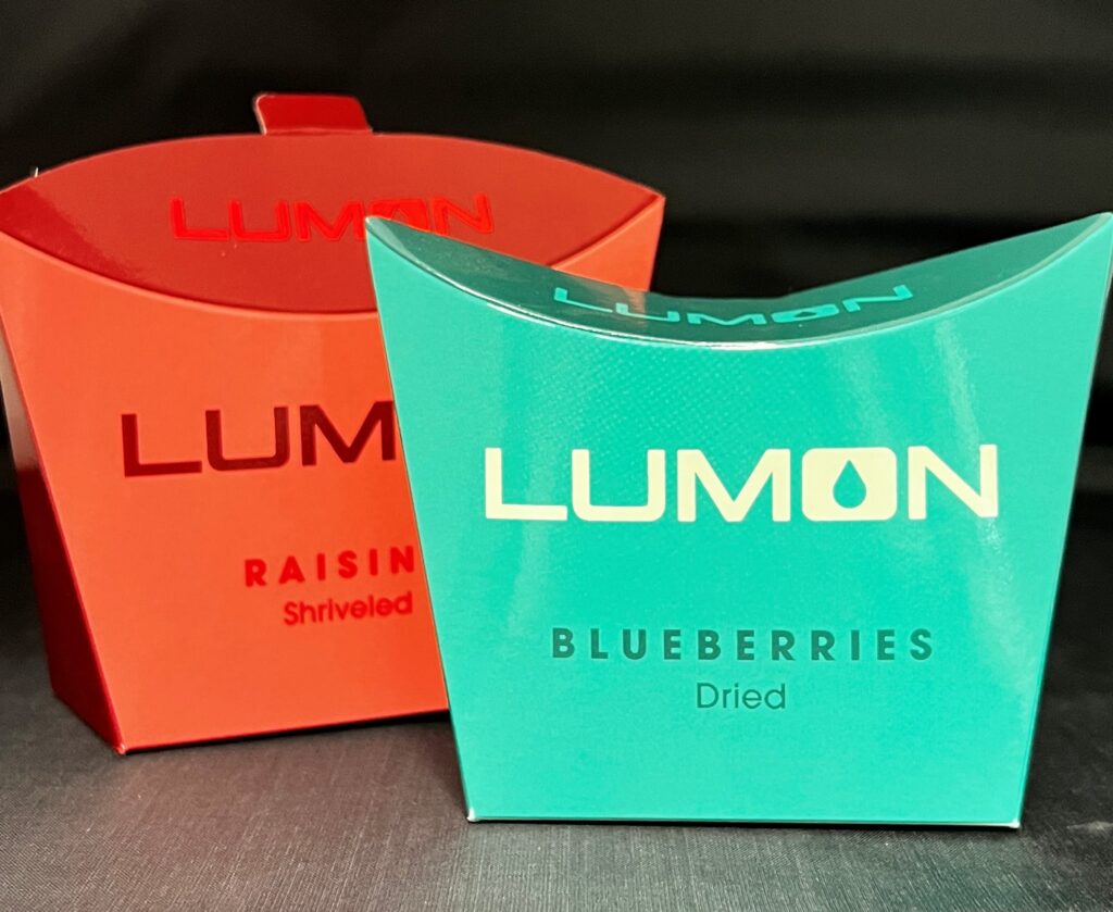
As part of the Severance design aesthetic, we utilized clean sleek lines, stylish yet utilitarian design, and appealing colors to carefully fit the overall look and feel of the show. The snack boxes have proven so popular there are eagle-eyed viewers and dedicated internet threads who track product packaging and consumption by various characters on the show! Not only have the vending machine boxes become widely recognized as part of the overall “branding” of Lumon Industries, but they have also been utilized as a clever guerrilla marketing strategy in real vending machines.
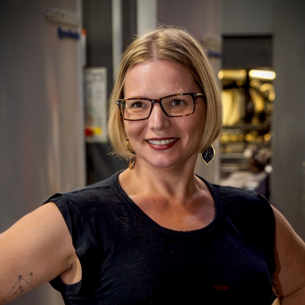
After seeing his client’s project come to life on screen, Steve remarked, “Working with the pre-production of a show of this caliber was a dream come true. It was really exciting to combine my packaging knowledge with my love for film.”
The next time an on-screen character uses a branded product or opens a package, take a close look at the prop. Chances are, it was concepted, created, and produced specifically for that show and scene. And very possibly, it was printed by SunDance!
Do you have printing or packaging needs for an existing or conceptual project? Contact us to see how we can help you create the perfect print and packaging strategy to move your brand forward and onto center stage.
Want to connect with Steve Kirchof? Click here!